http://www.gestalten.tv/motion/erik-spiekermann
Wednesday, 2 February 2011
Monday, 31 January 2011
Wednesday, 5 January 2011

Monday, 22 November 2010
Communication Technology: Widget Type


I've also added a subheading to make it more obvious what the text is about.
The final thing I've done is to choose Thonburi for the body text as one of its properties is relatively generous leading- this makes it much more friendly to the eye when viewed on screen.
Thursday, 18 November 2010
The Times: Layout & Type

The Times looks more like a newspaper than comparable newspaper websites. Although most are similar, this has an explicit link, complete with a border and correct dimensions.
Times New Roman is interestingly used for both body and header text. It gives the paper a rather traditional, Conservative look which suits its target market, but is actually less practical on screen.
I notice that there is increased leading on the headers, and a large amount of space under the image caption to make a clear divide between that and other sections. To reinforce these boundaries, subtle grey lines have been drawn.
Monday, 8 November 2010
Guardian: Capital offenders: the case against uppercase
New York City is right to change the style of its street signs. Good, clear typography DOES NOT NEED TO SHOUT
At least, that's what the US federal highway administration believes. According to the New York Post:
"Studies have shown that it is harder to read all-caps signs, and those extra milliseconds spent staring away from the road have been shown to increase the likelihood of accidents, particularly among older drivers."
In New York City, this will mean replacing 250,900 street signs with signs that cap up only the initial letter. So BROADWAY will become Broadway. A new font, Clearview, has been developed for the purpose. Cost: $27.6m (although, to put that figure in perspective, 8,000 signs have to be replaced every year for $110 each through normal wear and tear).
Officials argue that the changes will save lives and the city's transportation commissioner, Janette Sadik-Khan, also suggested that the new signs might reflect a kinder, gentler New York. "On the internet, writing in all caps means you are shouting," she said. "Our new signs can quiet down, as well."
Despite hysterical Daily News coverage that said "several" New Yorkers were "outraged" by the change – it quoted three – the paper's own poll showed that two-thirds of the public is behind the switch from capital letters.
It won't surprise regular Guardian readers that I agree with them. TheGuardian style guide has long encouraged the gradual move away from capitals. So do other newspapers and websites, although some venerable style guides are still agonising over whether to lowercase internet and world wide web. (Be assured they will do so, perhaps in time for the 22nd century.)
In part, the switch from capitals reflects a society that is less deferential than in the days when the Manchester Guardian would write something like this: "The CHANCELLOR OF THE EXCHEQUER, Mr LLOYD GEORGE, presented the Naval Estimates to Ministers and Members of the House."
Most readers seem comfortable with a less formal style. A grand total of two people complained about our coverage of the pope's, rather than the Pope's, recent visit to the UK. We did receive a letter last week complaining that calling David Cameron the prime minister, not the Prime Minister (a style we have been following for more than a decade) reflected a "lowering of standards", but such complaints are few.
We need to be ever-vigilant, however, against the capital offenders. Politicians, civil servants and Estate Agents are three groups that remain intent on drowning us all in this alphabet soup. (Yesterday I was presented with a government statement that said: "On the Chancellor's recommendation the Prime Minister has appointed the Secretary of State for Energy and Climate Change to the Public Expenditure Committee ... ")
Capitals do have their uses, of course. As the Urban Dictionary puts it: "Capitalisation is the difference between 'I had to help my uncle Jack off a horse' and 'I had to help my uncle jack off a horse.'"
To return to traffic signs. New York's commendable decision is an echo of one taken in the UK 50 years ago, when the brilliant designers Jock Kinneir and Margaret Calvert, given the task of updating the country's chaotic system of road signs, concluded that "a combination of upper and lowercase letters would be more legible than conventional uppercase lettering". They produced a new font, known as Transport, which they felt would be friendlier and more appealing to British drivers than the stark modernist style used in continental Europe. The classic British road signage that they designed is still in use.
Wednesday, 20 October 2010
BBC: What's so wrong with Comic Sans?
http://www.bbc.co.uk/news/magazine-11582548
Comic Sans, that unassuming jaunty typeface lurking inside millions of computers, has become the target of an online hate campaign. Simon Garfield explains why normally mild-mannered people are so enraged by its use.
How did schools ever advertise their Christmas fairs without it? Has a homemade birthday card ever looked so friendly written in anything else? Have type lovers ever found anything they loathe as much?
If you wrote these questions in Comic Sans you'd have something that was warm, inoffensive and rather unsuitable, a font that's gone wrong. And you'd also have something guaranteed to provoke a howl of protest.
Comic Sans is unique: used the world over, it's a typeface doesn't really want to be type. It looks homely and handwritten, something perfect for things we deem to be fun and liberating. Great for the awnings of toyshops, less good on news websites or on gravestones and the sides of ambulances.
Last year it stuck out like an unfunny joke in Time magazine and adidas adverts, and even the BBC wasn't immune, choosing the font to promote its Composers of the Year during the Proms.
What can be done? One can buy the "Ban Comic Sans" mugs, caps and T-shirts, and help finance a documentary called Comic Sans, Or the Most Hated Font In The World.
Black-tie do (not)
Holly and David Combs, the husband and wife cottage industry behind bancomicsans.com, argue that the misuse of the font is "analogous to showing up for a black tie event in a clown costume". Some of what the Combses have to say is tongue-in-cheek, but it is hard to disagree with their claims that type - used well or badly - has the ability to express meaning far beyond the basic words it clothes.
The bunny gets it Bunny boiler - just a taste of the antipathy
But why, more than any other font, has Comic Sans inspired so much revulsion?
Partly because its ubiquity has led to such misuse (or at least to uses far beyond its original intentions). And partly because it is so irritably simple, so apparently written by a small child. Helvetica is everywhere and simple too, but it usually has the air of modern Swiss sophistication about it, or at least corporate authority. Comic Sans just smirks at you, and begs to be printed in multiple colours.
Perhaps the most comic thing about Comic Sans is that it was never designed as a font for common use. It was intended merely as a perfect solution to a small corporate problem.
It was created in 1994 by Vincent Connare, who worked at Microsoft with the title of "typographic engineer".
Mrs Gates' role
In 1994, Connare looked at his computer screen and saw something strange. He was clicking his way through an unreleased trial copy of Microsoft Bob, a software package designed to be particularly user-friendly. It included a finance manager and a word processor, and for a time was the responsibility of Melinda French, who later became Mrs Bill Gates.
Typesetters in the Olden Days Typesetters of old - unlikely to have received it warmly
But the typeface it used was Times New Roman, which Connare judged to be a strange choice. It was a little harsh and schoolmasterly, not to say boring. It was not something that would hold your hand in a welcoming way.
Connare was a fan of the graphic novel, and was inspired by the speech bubbles to create something simple and rounded, letters that might have been created by cutting with blunt scissors (the truth is he used a popular font-making software package).
His font, not yet called Comic Sans, was rejected for technical reasons (it didn't fit the existing grids), but not long afterwards was adopted for the successful Microsoft Movie Maker. It was then included as a supplementary typeface in the Windows 95 operating system, where everyone with a PC could not only see it, but use it.
Better than Times New Roman
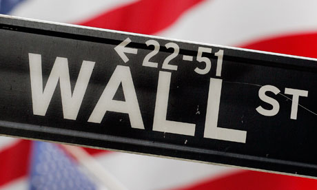
And thus it became a global phenomenon, something that would inspire attention from Design Week magazine to the Wall St Journal. Connare later explained why it worked so well: "'Because it's sometimes better than Times New Roman, that's why."
Comic Sans' inventor
When Vincent Connare designed Comic Sans he wasn't looking for worldwide notoriety. He began life as a painter and photographer, but has since established a reputation as a serious but entertaining graphic communicator.
His other typefaces include Trebuchet and Magpie.
He accepts all the anti-Comic Sans fuss with good grace but, alas, without royalties (he was a staffer when he made it).
When people ask him at dinner parties what he does, he tells them he designs type. 'You might have heard of Comic Sans,' he suggests. And everybody says yes.
One thing the Comic Sans debate has demonstrated beyond doubt is that one's choice of font is now a serious affair.
Twenty years ago fonts were not something most of us gave much of a second thought. Unless we were in the print or design industries, fonts were something we accepted rather than chose.
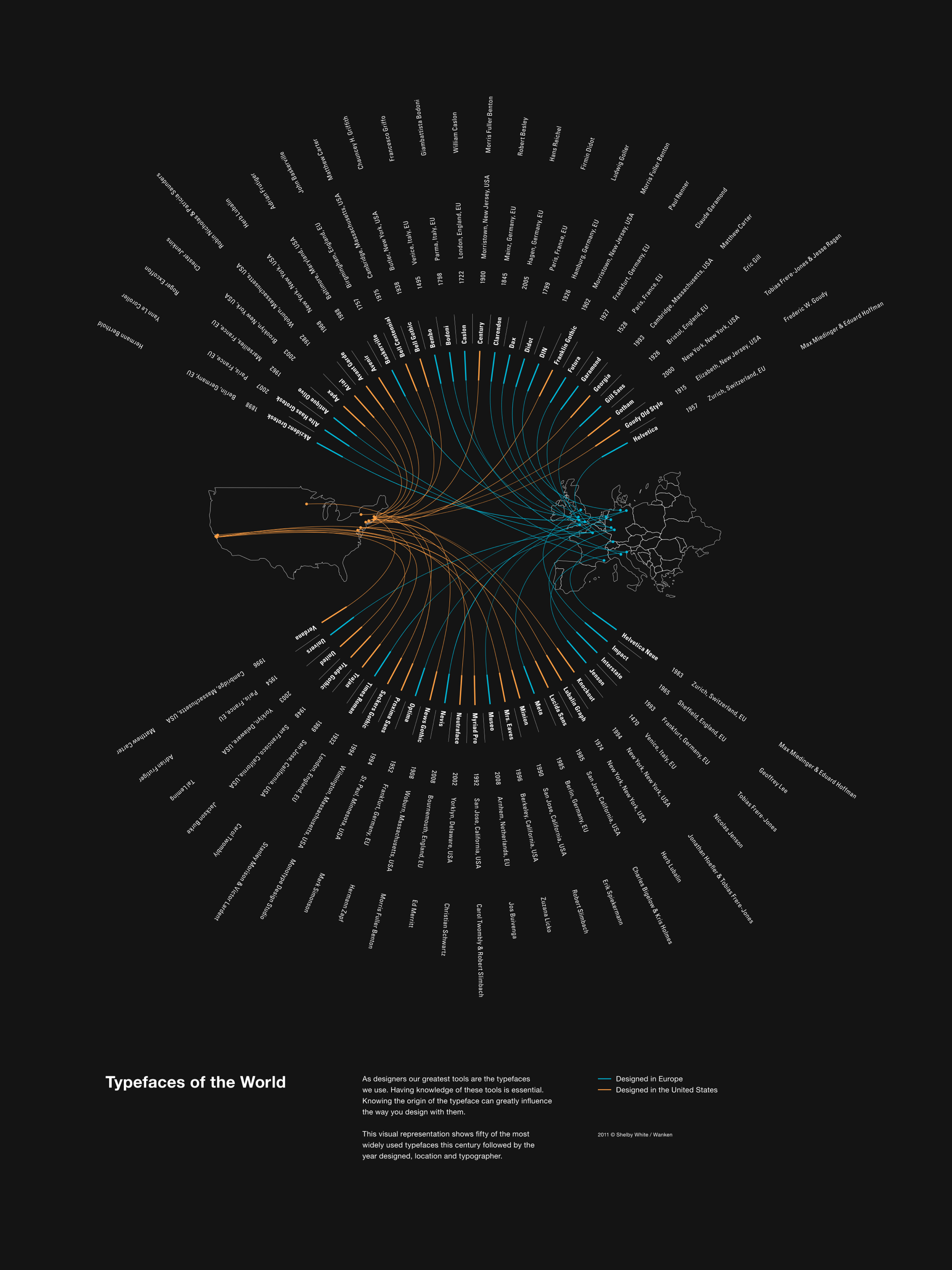
The pull-down menu on our computers changed everything. Here was a way of expressing our intentions and emotions in a new way, a choice that stretched from digital updates of Garamond from the 16th Century up to modern screen fonts such as Georgia and Calibri.
We could employ the efficient Gill Sans for job applications or the more elegant Didot for wedding invitations. We could become familiar with the differences between serif faces and sans serifs, the former with feet and tips on their letters, the latter usually with a less formal air. And we could unleash a seemingly harmless childlike new font on a defenceless world.
Almost inevitably, the Comic Sans backlash has produced a backlash of its own. There are already signs that the font may be becoming retro-chic, in the same way that we now embrace 80s fashion and pop. Most significant of all, it has become highly regarded by those who work with dyslexic children - one of the better uses for which it was never intended.
Simon Garfield wrote this article in Georgia regular. He is the author of Just My Type: A Book About Fonts, published by Profile Books.
Comments
It does have a use: rather like Dan Brown books or baseball hats with beercans attached, it marks the user out as someone to be avoided.
Tim Footman, Bangkok/London
Why must the BBC continue to give this font the oxygen of publicity? Can't we just let it wither away?
Mark Scott, Basingstoke, UK
The main problem I have with Comic Sans is that it makes everything written in it look like a parish newsletter pinned to a noticeboard outside the local church. It also smacks of faux joviality - you can imagine the CEO of some multinational using it memos to make himself appear approachable. However, children like it - so perhaps like blunt-edged play scissors its use should be restricted to the classroom.
Chris Limb, Brighton, UK
There's a great Hitler Downfall video deriding Comic Sans - apparently a new SS recruiting poster is going to use it. No prizes for guessing the font used for the subtitles.
Comic Sans, that unassuming jaunty typeface lurking inside millions of computers, has become the target of an online hate campaign. Simon Garfield explains why normally mild-mannered people are so enraged by its use.
How did schools ever advertise their Christmas fairs without it? Has a homemade birthday card ever looked so friendly written in anything else? Have type lovers ever found anything they loathe as much?
If you wrote these questions in Comic Sans you'd have something that was warm, inoffensive and rather unsuitable, a font that's gone wrong. And you'd also have something guaranteed to provoke a howl of protest.
Comic Sans is unique: used the world over, it's a typeface doesn't really want to be type. It looks homely and handwritten, something perfect for things we deem to be fun and liberating. Great for the awnings of toyshops, less good on news websites or on gravestones and the sides of ambulances.
Last year it stuck out like an unfunny joke in Time magazine and adidas adverts, and even the BBC wasn't immune, choosing the font to promote its Composers of the Year during the Proms.
What can be done? One can buy the "Ban Comic Sans" mugs, caps and T-shirts, and help finance a documentary called Comic Sans, Or the Most Hated Font In The World.
Black-tie do (not)
Holly and David Combs, the husband and wife cottage industry behind bancomicsans.com, argue that the misuse of the font is "analogous to showing up for a black tie event in a clown costume". Some of what the Combses have to say is tongue-in-cheek, but it is hard to disagree with their claims that type - used well or badly - has the ability to express meaning far beyond the basic words it clothes.
The bunny gets it Bunny boiler - just a taste of the antipathy
But why, more than any other font, has Comic Sans inspired so much revulsion?
Partly because its ubiquity has led to such misuse (or at least to uses far beyond its original intentions). And partly because it is so irritably simple, so apparently written by a small child. Helvetica is everywhere and simple too, but it usually has the air of modern Swiss sophistication about it, or at least corporate authority. Comic Sans just smirks at you, and begs to be printed in multiple colours.
Perhaps the most comic thing about Comic Sans is that it was never designed as a font for common use. It was intended merely as a perfect solution to a small corporate problem.
It was created in 1994 by Vincent Connare, who worked at Microsoft with the title of "typographic engineer".
Mrs Gates' role
In 1994, Connare looked at his computer screen and saw something strange. He was clicking his way through an unreleased trial copy of Microsoft Bob, a software package designed to be particularly user-friendly. It included a finance manager and a word processor, and for a time was the responsibility of Melinda French, who later became Mrs Bill Gates.
Typesetters in the Olden Days Typesetters of old - unlikely to have received it warmly
But the typeface it used was Times New Roman, which Connare judged to be a strange choice. It was a little harsh and schoolmasterly, not to say boring. It was not something that would hold your hand in a welcoming way.
Connare was a fan of the graphic novel, and was inspired by the speech bubbles to create something simple and rounded, letters that might have been created by cutting with blunt scissors (the truth is he used a popular font-making software package).
His font, not yet called Comic Sans, was rejected for technical reasons (it didn't fit the existing grids), but not long afterwards was adopted for the successful Microsoft Movie Maker. It was then included as a supplementary typeface in the Windows 95 operating system, where everyone with a PC could not only see it, but use it.
Better than Times New Roman
And thus it became a global phenomenon, something that would inspire attention from Design Week magazine to the Wall St Journal. Connare later explained why it worked so well: "'Because it's sometimes better than Times New Roman, that's why."
Comic Sans' inventor
When Vincent Connare designed Comic Sans he wasn't looking for worldwide notoriety. He began life as a painter and photographer, but has since established a reputation as a serious but entertaining graphic communicator.
His other typefaces include Trebuchet and Magpie.
He accepts all the anti-Comic Sans fuss with good grace but, alas, without royalties (he was a staffer when he made it).
When people ask him at dinner parties what he does, he tells them he designs type. 'You might have heard of Comic Sans,' he suggests. And everybody says yes.
One thing the Comic Sans debate has demonstrated beyond doubt is that one's choice of font is now a serious affair.
Twenty years ago fonts were not something most of us gave much of a second thought. Unless we were in the print or design industries, fonts were something we accepted rather than chose.
The pull-down menu on our computers changed everything. Here was a way of expressing our intentions and emotions in a new way, a choice that stretched from digital updates of Garamond from the 16th Century up to modern screen fonts such as Georgia and Calibri.
We could employ the efficient Gill Sans for job applications or the more elegant Didot for wedding invitations. We could become familiar with the differences between serif faces and sans serifs, the former with feet and tips on their letters, the latter usually with a less formal air. And we could unleash a seemingly harmless childlike new font on a defenceless world.
Almost inevitably, the Comic Sans backlash has produced a backlash of its own. There are already signs that the font may be becoming retro-chic, in the same way that we now embrace 80s fashion and pop. Most significant of all, it has become highly regarded by those who work with dyslexic children - one of the better uses for which it was never intended.
Simon Garfield wrote this article in Georgia regular. He is the author of Just My Type: A Book About Fonts, published by Profile Books.
Comments
It does have a use: rather like Dan Brown books or baseball hats with beercans attached, it marks the user out as someone to be avoided.
Tim Footman, Bangkok/London
Why must the BBC continue to give this font the oxygen of publicity? Can't we just let it wither away?
Mark Scott, Basingstoke, UK
The main problem I have with Comic Sans is that it makes everything written in it look like a parish newsletter pinned to a noticeboard outside the local church. It also smacks of faux joviality - you can imagine the CEO of some multinational using it memos to make himself appear approachable. However, children like it - so perhaps like blunt-edged play scissors its use should be restricted to the classroom.
Chris Limb, Brighton, UK
There's a great Hitler Downfall video deriding Comic Sans - apparently a new SS recruiting poster is going to use it. No prizes for guessing the font used for the subtitles.
Subscribe to:
Posts (Atom)